Getting Started
Let's create a simple Counter component. It will contain a number and a button. By clicking on the button, the number will increase, i.e. count the clicks.
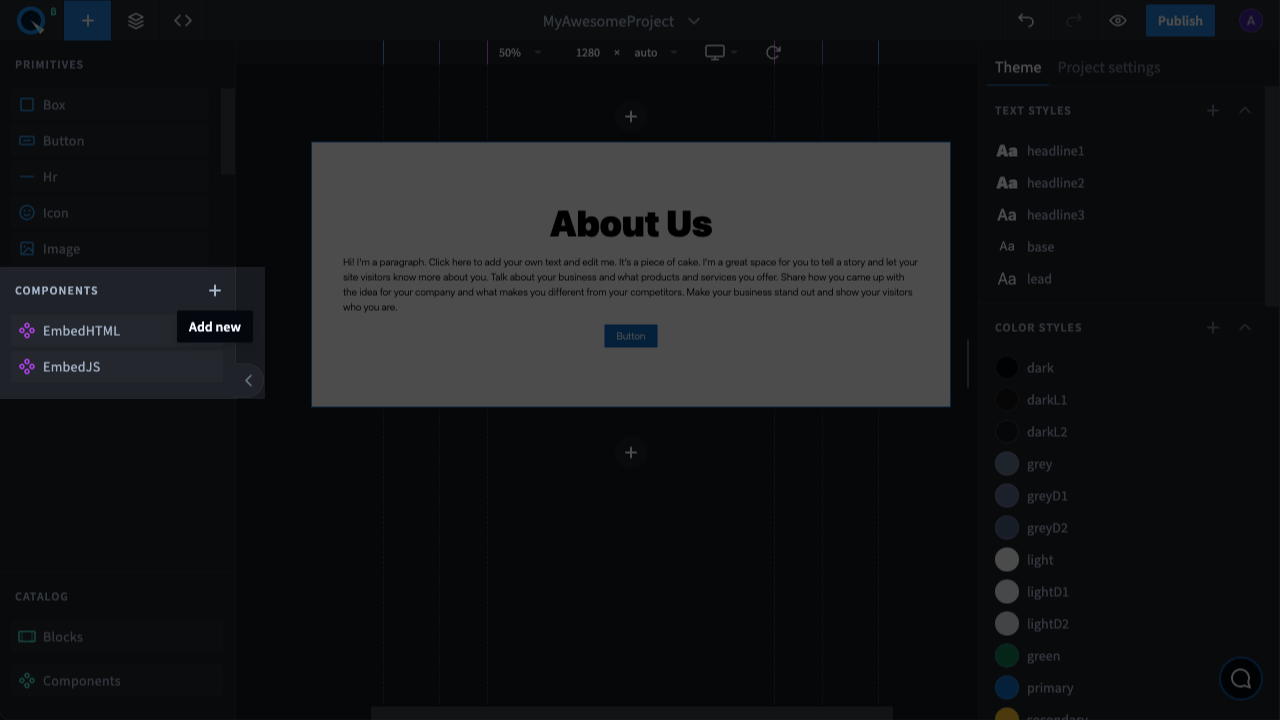
- Create a new component by clicking the "+" icon in the Code Editor and enter the name of the component, for example,
Counter.
- After entering the component name, the Code Editor will open, and you will see the default code of the component.
- First, add the import of the
useStateanduseCallbackhooks from the React library, theButtonprimitive, and theuseOverrideshook:
- Then after importing, add override descriptions which will be used later. We'll just add a button description. Let's call it
My Button, apply the props from theButtonprimitive, and specify the captioncolor.
Let's edit the component props. Add a
numbtext field that will contain the number by which the counter will increased.To do that, replace the
yourCustomPropsproperty in thepropInfoobject with a new one:At the end of the export, add an object with the default value
numb:After describing the override list, add the component code:
- Call the previously imported useOverrides hook to be able to apply overrides;
- Add useState to store the counter state. It returns counter with the current value and the setCounter function to update the value;
- Create an onIncrement function that will increase the counter digit by 1. We added useCallback so that the function is created only when setCounter changes, not every time the component is updated.
- Let's edit the component structure:
- Replace
{...props}with the new{...rest}we got from useOverrides; - Display the current
{{counter: ${counter}}}; value - Add a Button with the "Increment" caption where we call the override function with our override name and pass the previously created onIncrement function which will be called by click.
- After displaying the button, you can add
{children}to be able to add any other component to this one.
- Replace
The new component code looks like this:
Press
Ctrl+Sor⌘ (Cmd)+Sfor MacOS to save the changes.
Congrats! You've created your first component on Quarkly. Now close the Code Editor, go to the Adding panel, and drag your new component from the list to the page. Check how it works in the preview mode (the "eye" icon in the upper right corner).
Learn more about the structure, component properties, overrides, and much more in the following sections of the documentation.